| Pages in topic: < [1 2] |
Updated job listings page Thread poster: ProZ.com Staff
|
|---|
hello,
The new layout looks fantastic. Nevertheless, I can't find any RSS feed and the older one is no longer working.
It would be great to include that feature in the new page, since it is extremely convenient to get the jobs proposals in our screen.
Hope that others will also react to this.
best regards,
Pierre Souchar
| | | |
| RSS feed added | Jul 20, 2018 |
Pierre Souchar wrote:
hello,
The new layout looks fantastic. Nevertheless, I can't find any RSS feed and the older one is no longer working.
It would be great to include that feature in the new page, since it is extremely convenient to get the jobs proposals in our screen.
Hope that others will also react to this.
best regards,
Pierre Souchar
Hi Pierre,
An RSS feed has been added. You can access it by clicking the RSS icon to the right of the "Browse ProZ.com jobs" header.
| | | |
| The more the better | Jul 22, 2018 |
I'd like to say that the filter options 'Poster country/continent' and 'Poster country/continent (excluded)' would be more useful in the form of 'Poster countries/continents' and 'Poster countries/continents (excluded)'
The option of just one country/continent is the solution of little use for translators working all over the world.
| | | |
Tom in London
United Kingdom
Local time: 17:37
Member (2008)
Italian to English
| Language pair | Jul 22, 2018 |
The things I look for in descending order of importance are:
1. Language pair
2: Trados or not.
3: Whether the job is translation or so-called "revision"
then all the other stuff.
[Edited at 2018-07-22 14:33 GMT]
| | |
|
|
|
| You can select more than one | Jul 23, 2018 |
island-vlad wrote:
I'd like to say that the filter options 'Poster country/continent' and 'Poster country/continent (excluded)' would be more useful in the form of 'Poster countries/continents' and 'Poster countries/continents (excluded)'
The option of just one country/continent is the solution of little use for translators working all over the world.
You can select more than one by using Ctrl+Click on several items in the list.
| | | |
James Dirgin 
United States
Local time: 10:37
Member (2014)
Turkish to English
+ ...
horrible...to put it mildly.
| | | |
Moltolavoro 
Egypt
Local time: 19:37
English to Arabic
+ ...
| The previous design was much better! | Jul 24, 2018 |
The previous design was much better!
The new one is horrible.
| | | |
Hala Gamal 
Egypt
Local time: 19:37
English to Arabic
+ ...
I like the new design, it's very smooth and easy to use
| | |
|
|
|
Debora Blake 
France
Local time: 18:37
Member
French to English
+ ...
| "Modern" is definitely NOT "Improved" | Aug 4, 2018 |

Observations
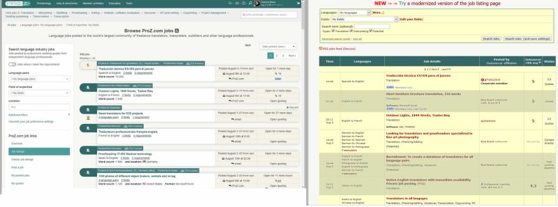
1. New page is much too cluttered and spaced out --> Old page is clear, clean and compact
2. New page is not intuitive at all --> Old page is simple to use at a glance
3. New page hides important information behind unhelpful rollovers --> Old page displays all pertinent info by default
4. New page is filled with useless and confusing icons --> Old page intelligently uses meaningful icons that HELP us
5. New page lacks color to attract the eye to important elements --> Old page red/yellow/black color scheme makes it very easy to read and SEE the information
6. New page layout is a jumbled mess with no logical order --> Old page has straightforward order "When, What, Details, By whom, Their rating and Competing quotes.
7. New pages looks horrible --> Old page looks perfectly fine!
Summary:
1. Generally speaking, in webdesign these days, "modern" is rarely "better".
2. Consider the user experience before destroying something that works.
3. Consider your true motivation for these "improvements".
4. Consider how many negative reactions the new page has received.
5. Users shouldn't "have to get used to" something that is just plain bad.
Conclusion:
If you MUST change to this new, horrible page, then please at least KEEP the option to allow us to switch to the old, efficient page.... and track your web stats to see how many people use it!
| | | |
Tom in London
United Kingdom
Local time: 17:37
Member (2008)
Italian to English
technically the page works OK but I suggest you get a high quality web graphics designer - a really good one who has an international outlook - to take on the task of designing the GUI. Currently with this new "modernisation" it looks like we've gone back to the 1970s - this is a long way away from what we expect from web design today and as the Italians say "anche l'occhio vuole la sua parte"! (what it looks like also matters)
[Edited at 2018-08-04 14:36 GMT]
| | | |
| Pages in topic: < [1 2] |


